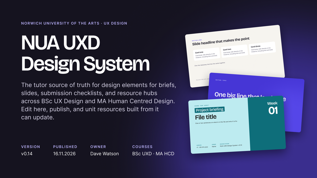
I built a Figma design system that brings a unit's briefs, schedule and submission checklists together on one page, inside the tool my UX Design students already design in. Each student has their own copy of that page, where they track their progress against the checklists as they work. The same design system styles our lecture and workshop slides, so everything a student sees looks and reads consistently.
I'm piloting it with my BSc UX Design students, who asked for it. I built most of it in conversation with Claude through Figma's MCP server, which let me make the design and architecture decisions while Claude did the scripting.
The problem
Our course materials were spread across several places. Briefs were made in Word, exported to PDF and uploaded to the VLE. Slide decks were made in Keynote, exported to PDF and uploaded to the VLE. Last year's submission checklist lived on a Miro board, separate from both the briefs and the schedule.
Students had to cross-reference these sources, while their design work happened somewhere else, in their own Figma spaces. Decks had drifted apart visually over the years, built from different starting points, or with slides pulled in from different decks.
We teach students to build consistent design systems, so it made sense to apply the same thinking to our own materials. I wanted:
- Schedule, briefs and checklists seen together, inside the tool students already design in
- A simple way for students to track their own progress towards submission
- One visual system for documents and slides, so a design improvement reaches every file without rebuilding each one
- A live online space where content changes can be made in a single step without, for example, re-exporting PDFs and re-uploading to the VLE
How it fits together
The system has three layers:
- One design system file in a staff team holds the colours, type, components and slide templates, published as a library.
- One unit resources folder per unit per cohort. This holds the unit overview (briefs, schedule, submission checklists), lecture slides, interactive workshop files and design resources such as wireframing kits.
- One unit overview file per student sits in a private folder that only the student and their tutors can see, holding their own copy of their submission checklist.
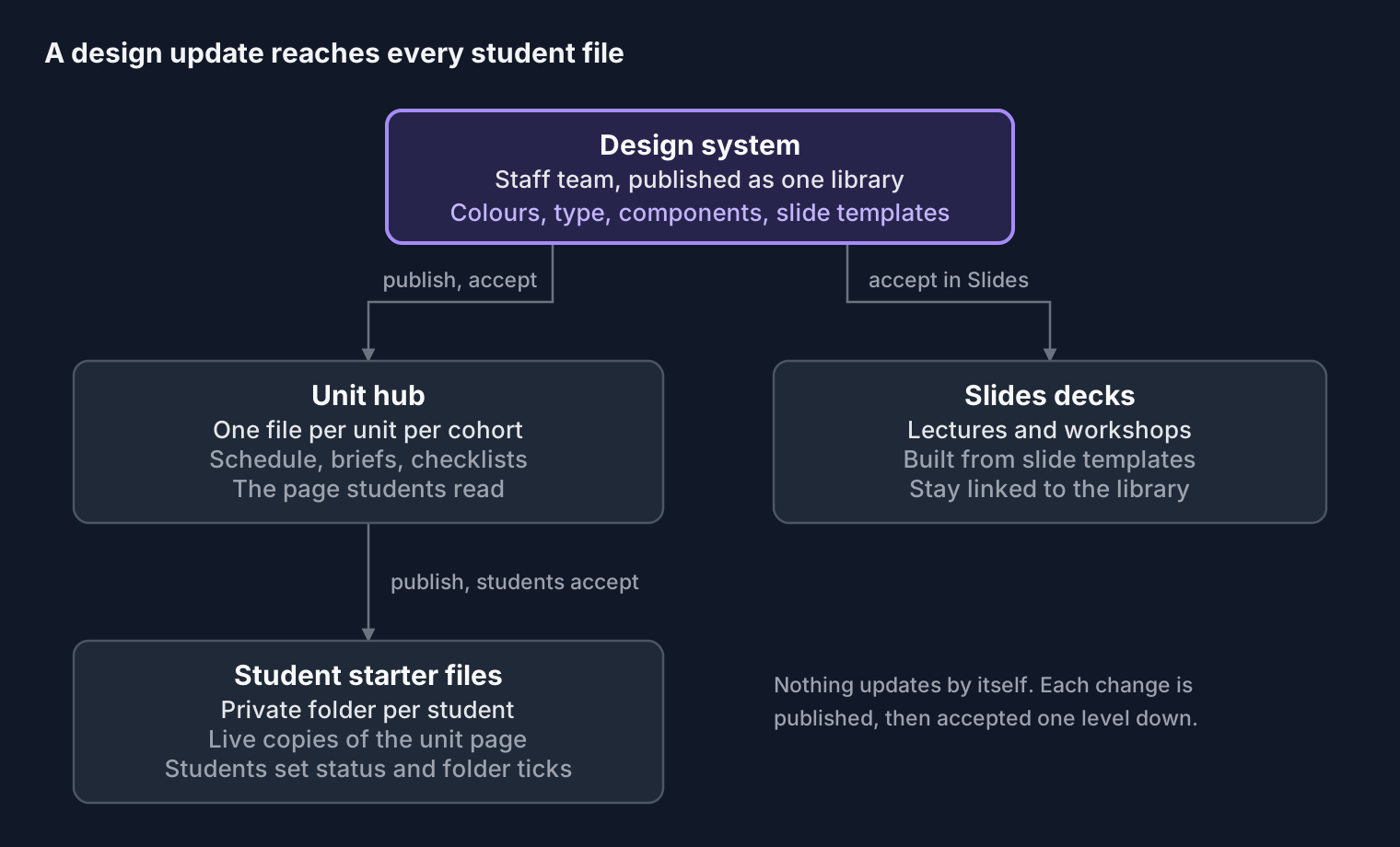
The diagram shows how design updates travel. Each file carries a design system version number, so it's clear which version of the system it is using.
What changes, and what doesn't
Briefs go through the university's usual sign-off before they are shared, and the text doesn't change once students have been briefed. Figma carries that approved text, so there is no drift between the brief in Figma and the brief on the VLE.
What travels through the system after release is design only: type, colour, spacing, layout and component improvements. They change how the page looks, never what a brief asks students to do.
Submission keeps its safety net. Students still export .fig, .jam and .pdf files and .mp4 walkthroughs and include these in their submissions, so a complete copy of the work always sits outside Figma, alongside the work already visible to tutors inside students' Figma workspaces.
Designing the system
The foundations are deliberately small to begin with: one theme, type and colour scales, a spacing and radius scale, and variables holding things like the design system version number and the date and time of the last update.
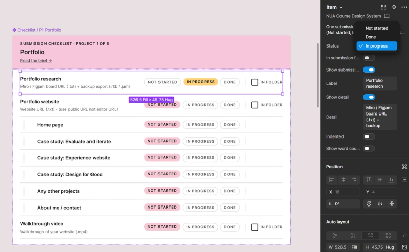
The submission checklist item. Each item has three status pills (Not started in pink, In progress in amber, Done in green) and an "In submission folder" tick. Students change them from Figma's component properties panel. Essay items can be indented under a parent line and tagged "In word count" or "Not counted". I looked into click-to-change status, but clicks only work in prototype view and reset afterwards. A widget could hold state, but widgets can't live inside components, so they wouldn't update centrally. The panel was the best option, and it supports students' learning around component properties.
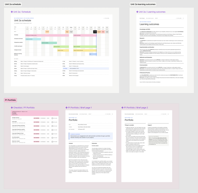
One page per unit. The unit schedule sits at the top, then each project gets its own section, tinted in its project colour, with the checklist in one aligned column on the left and the A4 brief pages to its right. Students see the whole unit, what is due when, and how far they've got, in one view.
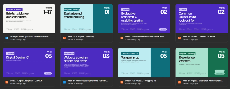
Covers that work as thumbnails. File covers come in variants for unit overviews, unit briefings, project briefings and lectures or workshops, sized 1920 by 1080 to match Figma's file thumbnails. The week number is legible in the file browser. A session tied to one project uses that project's colours, so a Week 5 workshop for the Microsite visibly belongs to the Microsite brief. Covers can also carry "Play recording" buttons linking to lecture and briefing recordings in Panopto.
Expressive slide templates. Covers, cards, steps, comparisons, stats, tables, tagged lists, text with media, full-bleed media, books, speaker introductions and diagrams. Every layout can carry text links or buttons.
Leaving room for one-offs. I decided diagrams shouldn't be templated. Most are bespoke, and a system that tries to control them gets in the way. A Diagram slide gives the header, note and sources, and the drawing goes on top in the system's type styles and colours, so it still follows later changes.
Working with Claude through Figma MCP
This work became possible at speed because I could work with Claude directly inside Figma through its MCP server. I made the design and architecture decisions and tested them with students. Claude wrote and ran the Plugin API scripts that build and maintain everything.
That split made some things practical that would otherwise have eaten weeks:
- Brief layout conversion. Briefs made in Word were adapted to a cleaner, clearer design in Figma, with text flowing into two columns across A4 pages, and scripts for keep-with-next on headings and automatic checks for orphaned words and blocks.
- Deck conversion. Old Keynote decks are imported into a Figma workshop file using the Div Riots Office-To-Figma plugin, then rebuilt slide by slide from the design system templates, with me working in tandem with Claude.
- Pushing updates. When a component changes, existing instances can be swapped to the new version by script, keeping their content and links.
- Slide deck templates. Slide layouts can be swapped for others in the system and retain their content. This system beats the Figma Slides templates system because a Figma Slides template is a starting point for a new deck, with no way to send a later design change out to the decks already made from it.
- Error checking and content suggestions. With my slide content in Figma and Claude able to access it all, it can check for errors and typos, make content recommendations and updates, and implement them for me.
The most useful thing turned out to be writing the rules down. A shared working-rules document records how Claude should work with me and how changes are made. For example, every change to the design system bumps the version and date variables and adds a Version History entry; Claude does that automatically so I don't have to remember. It also records the gotchas we found (text properties lost when cloning a variant, auto layout collapsing when a boolean hides a child) so they don't get rediscovered. Publishing, permissions, and moving and deleting files stay with me, because those are UI-only in Figma.
Introducing it to students
This pilot came from a focus group and rep meeting with my Year 2 and 3 students, exploring how their course content is organised and how that might be improved. It also gives us a live design system to talk about, use and modify in class: why the components are built the way they are, and how updates move through a library.
When I introduced it, I walked students through where the content lives and how to use it: reading the briefs on the unit page, finding their own copy in their private folder, and setting checklist statuses and folder ticks from the component properties panel. I checked that they understood it and could use it themselves.
Where it is now
In about five weeks the system went from first sketch to v0.13. It now runs two units across two cohorts:
- Units 2a and 3a: a unit overview page with the schedule, project briefs and their checklists, with a copy in each of the students' private folders
- Decks: lecture and workshop decks converted into Figma Slides from the templates, with progress tracked on a FigJam board
- Documentation: how-to-use guides for documents, slides and the system itself, a Foundations page and a version history inside the design system file
Each year will be frozen by duplicating the cohort file, so next year's changes don't rewrite this year's record.
What I learned
The tools' limits shaped the design. Clicks that can't persist in checklists, links that only work on text in design mode, libraries that only update when accepted. Each one shaped a decision, and the system is better for working with them rather than around them.
Templates have edges. Slides and checklists benefit from strict components. That's less true for diagrams. Knowing where to stop templating mattered as much as what to template.
Writing the rules down is the system. The components are only half of it. The working rules and version history are what let me hand work to Claude, come back a week later and trust what's there.
What's next
- Run a full usability session with both cohorts and gather structured feedback
- Prepare Units 3b and 2b, following the usual sign-off process, and release each when its unit starts
- Hide building-block components from students so the Assets panel shows only what they need
- Bring MA Human Centred Design content into the same system, starting with sessions shared across courses